Contents…

I’ve been asked enough times over the years for suggestions on various inking materials. So, I think it’s finally time I sit down and do a blog post on them. I’m going to start with brushes, which have the widest range of marks and applications when it comes to ink.
I’ve been inking with a brush since college. Before that time, I was using the microns and Faber Castel brush pens that many young artists cut their teeth on. Ultimately, I found those tools to be less than ideal. Before the advent of jetpens.com, ink slingers were relegated to what was available at their local art or craft store in terms of brush pens and liners, and those options were severely limited.
I picked up a brush at the suggestion of one of my professors and haven’t looked back. Not only are brushes a more ecological and economical option to brush pens (which are often disposable), they offer a wider range of mark making options, which means less switching between tools during the creation of a piece.
So, let’s talk about some available brush options, what they are capable of, and some techniques for practice and study.
Brushes
There are as many variations of brushes as there are inking techniques. That is to say: there’s a lot out there to choose from. I’m going to keep my list fairly short, limiting it to the most common types of inking brushes. Do not consider this a definitive list. If it can hold ink, you can ink with it.
IMPORTANT FOR NEW BRUSH BUYERS: Make sure you wash off the starch on a new brush. This is the stiffening agent used to keep the brush in shape prior to use. Soak a brush for a few minutes in lukewarm water – preferably in a shallow dish on its side – and then wash thoroughly until it is soft. Do not soak the brush head-down in a cup, or the brush will become misshapen.

Watercolor Round
These are probably the most accessible types of inking brushes for someone new to analog inking. They offer the cleanest line in addition to being fairly easy to control. Generally, you are looking for a round with good “snap” (a quick bounce back once the bristles are bent against the paper) and a tip that holds its shape for a decent period of time before it needs reshaping.
There are two major kinds of watercolor brushes: natural and synthetic. (Natural brushes are made with animal hair, so vegans may find this a less desirable option.) The best quality natural brushes are Kolinsky sable, produced from the tail hair of the Kolinsky (a type of weasel). Winsor Newton, Raphaël Kaërell (8408 is my preferred brand), and Princeton all have Kolinsky sable brush options. These brushes hold a fine point, retain their shape admirably, and snap back instantaneously. They are also extremely expensive, and maybe not the best option for inkers on a budget (though they are a worthwhile investment, as I have Kolinsky sable brushes that are decades old).
If you are just starting out, sable and sable-mix brushes are cheaper options that will still provide good performance, even if they may not hold up quite as long as their more expensive counterparts. Both Raphaël and Princeton make brushes using lesser quality hair that perform nearly as well as their more expensive counterparts (and are a preferred brush for some inkers, who are particularly hard on their brushes and tend to burn through them quickly). However, my favorite mix brush is Silver Black Velvet, which is an incredible brush for extremely detailed work and also a great watercolor brush, though it is nearly as expensive as its high end counterparts.
Synthetic brushes are also available in a large variety at very affordable prices. The biggest difference (with a few exceptions) I have noticed in synthetic bristle brushes is that they do not come to as fine a point as natural bristle brushes. This means if you want a very fine brush line, you need a much smaller brush that will hold less ink and require more dipping. That said, they are generally more affordable and also vegan friendly.
The brush I started inking with was Utrecht Synthetic Taklon size 1, which is an all around good lining brush that held up under heavy use for nearly a year. Raphaël Kaërell makes a very quality synthetic brush that I use for both inking and painting. I’ve also found a brand called Wonderforest that touts itself as a watercolor brush, but is really better for gouache, acrylic, or ink, because it doesn’t hold moisture well enough for watercolor, but has an excellent snap and point.

Asian Brushes
Another brush type specifically designed for use with ink are asian brushes, which includes Japanese Sumi Brushes and Chinese Ink Painting brushes. These brushes are made to hold a lot of ink and are great for expressive line work, dry brush technique, washes, and watercolor. My personal preference leans towards Chinese painting brushes, which come in a wide variety of shapes and hair types, each designed for particular purpose. There are numerous books written on the subject of Chinese ink painting and calligraphy. I have no formal training in the practice, so I will refrain from going into the specifics of Chinese ink painting technique. But these brushes are so versatile, I would be remiss not to mention them. They are my go-to for landscapes, textural work, dry brush, and expressive cartooning.
Generally, these brushes are made from animal hair, and while there are synthetic options, I’ve found those are more comparable to western watercolor rounds than the Asian brushes they are trying to emulate. The most important characteristic to look for when choosing these brushes is hair type, because this will effect snap and bounce in the brush. For a bouncier brush, you will want to look for “weasel” or “wolf” hair. This is similar to a sable in its performance and actually describes the same animal, since the Chinese translation of a weasel is literally “yellow-mouse-wolf.”
Other hair types include goat hair (little snap and better suited for washes or watercolor), horse hair (a brush with less snap, but one that produces great dry brush effects), and combination hair (normally a mix of goat and weasel, though like goat, better suited for washier applications). There are also a number of unique brush shapes available, like the “red feather” which has a wide belly and fine point; or the ‘twig,” a brush with a short, triangular appearance that makes interesting, winding lines.
I generally suggest leaning towards “hard” brushes, preferably made of weasel hair for a first timer. These will be easiest to control for someone accustomed to western brushes. Do not be put off by the general size of these brushes. They are designed for a wide range of marks and are capable of creating very fine lines and extremely thick drags of ink with a single stroke.

Shape Brushes
Not necessarily a different type of brush, but a consideration for different kinds of marks, are watercolor brushes of various shapes. Filbert, flat, angled, fan, or petal brushes all produce lines and marks of different quality than the standard watercolor round. These brushes can add broad areas of texture, calligraphic strokes, and unique line qualities to a work that may not be achievable with a basic round, but may provide more control than a Chinese painting brush or Sumi brush.
These are available in the same hair variety as any other watercolor brush. For inking, I would suggest avoiding squirrel or faux squirrel hair and leaning more towards the sables and taklons.
Ink & Paper
It would be possible for me to devote an entire blog post just to ink and paper supplies. Like brushes, there are so many types of ink and paper, and brands that produce each type, that this list could theoretically go on for several thousand words. Again, I will be putting down a general list of ink and paper types, but not a definitive one.
Ink
The largest consideration when it comes to ink is the type pf paper you are inking on and your preferred viscosity of ink. Personally, I use Dr. Ph Martin’s Bombay India Ink the most. It is kind of a goldilocks ink: not too thick, not too thin, good n’ dark, waterproof, thins out consistently, reasonably priced, and it doesn’t bleed on any paper I’ve used it with yet. That isn’t to say I don’t have an ink drawer with a surfeit of ink brands/types that I use for different and specific purposes, but this is the ink I need to restock the most.
However, Winsor Newton makes a fine drawing ink too, if a bit less even in large areas of spot black. Pelikan ink has lacquer in it, and produces very dark spot black. Dr. Ph Martin Black Star ink will go on cellophane without beading up. Sumi Ink is a big bang for your buck, very dark, and makes beautiful washes. Or buy a Chinese ink stick, and grind the ink yourself. Acrylic ink is a little thicker, and makes for good dry brush technique. And if you absolutely must buy the cheapest ink for your pocketbook, Black Cat is serviceable, though quite thin. You can thicken it up by letting it sit open overnight so some of the liquid evaporates.
When it comes to white ink for highlights and corrections, I’ve developed a preference to Deleter White 1 for details and Deleter White 2 for corrections. The former has a gouache-like quality, which makes it go on smoother and more opaquely when painting in details (even watered down), while the latter is closer to liquid acrylic, and is best suited for correcting a larger area or dry brush. It takes inking-over better than Deleter 1, which can sometimes absorb the ink and make it look grey. The Uniball Signo Borad is a good gel pen option for tiny corrections or lettering, though its shelf life is somewhat limited.
There are many comics pros that swear by Pro White, but I’ve never had any luck with this brand, because every bottle I’ve ever bought has been completely dried out and un-mixable when I open it. I think these tend to sit on the shelves too long.
Try to keep a separate brush for white and black ink, unless you want to have white and gray ink. And swipe a few coffee stirrers the next time you’re at the coffee shop. These are perfect for mixing up ink that may have sat on a shelf until the pigment settled at the bottom.
Paper
If you can afford nothing else, get yourself decent paper over a fancy brush or ink. Nothing is worse than paper that wrinkles up under heavy coats of ink or bleeds out the second you touch liquid to its surface. Can you use printer paper to ink on? Sure. In fact, because brushes apply ink in thin layers, this is more possible than trying to use a nib on printer paper.
But it can be a frustrating surface. Printer paper is extremely susceptible to humidity, has a more open weave and tends to bleed with thinner inks, will wrinkle over heavy areas of spot black, and it does not have the longevity of art papers. It will disintegrate and fall apart long before a piece of slightly more expensive Bristol.
If you are inking in stark black and white, a pad of good, old, trusty Bristol Board is your best bet. My brand is Strathmore 300, but most any bristol board will do. Some artists prefer a thicker Bristol because they really beat up a page. It goes without saying that “smooth” Bristol takes fine line work best, while “vellum” provides more texture and can even handle a wash or two without becoming over-soaked and pilly.
If you want to do a lot of heavy ink wash work, or plan on adding water based color (watercolor paint or colored ink) later, I would lean more towards a hot press watercolor paper, like arches. Is it more expensive? You bet. But even 90lb watercolor paper will handle that extra liquid better than 500 series bristol. It’s what the paper is made for. Also, if you’re aiming for more texture in your line, cold press and rough watercolor paper is something to look into. If you are doing sequential work and need a large quantity, you can test cheaper, student grade brands and see if they can accomplish what you are looking for while keeping you in budget.
Finally, there are the vellums and extra smooth papers designed for highly detailed work. I don’t use vellum much, unless I am designing color separations manually. For that I have a rediculous roll of old school, thick vellum paper I took from a former screen printing job before the place went out of business. I imagine one day I may have to hunt down a vellum brand I can recommend, but for now, I’d suggest sorting through reviews if you want to go that route.
I do enjoy the Strathmore Plate Bristol, which is a very smooth surface. However, I use it for nib and ink more than brush inking. There is also Borden and Reily’s Bleedproof Paper for Pens, which I discovered is not-quite bleedproof with certain inks. It takes India Ink and Sumi ink well enough and offers a plate surface at an inexpensive price.
Holy crud, are you still reading this? Good on you! It’s time to get to the meat of the matter…
Setting Up

Your setup doesn’t have to be overly complex. However, there are a few things that are useful to keep on hand:

An ink well is used to pour some ink from the bottle so that you are not dipping your brush directly into your source bottle of ink. This allows you to see how much ink you are getting on the brush and keeps you from overloading on ink. It also keeps a wet, dirty brush out of your bottle of ink, which will keep it from getting moldy or washy. Don’t go out and buy anything fancy. An old lip gloss container, well cleaned, has been my ink pot for a decade. Just make sure your “well” has an airtight cap so your ink doesn’t dry into goo.
A flat “dish” is good to have on hand for dry brush work, as it allows the ink to thicken up and become more suitable for brushing on dry. Any shallow container can work for this. I’ve upgraded to a little porcelain dish that I was given by a friend, but I used the top of a tube mailer for this purpose for years.
A water container feels like a no-brainer. Try to get a good size jar for this. And again, you can use any kind of jar you are about to trash or recycle. Stay away from metal tins because: rust. Do as I say and not as I do: try to clean out your ink jar on a regular basis or risk starting a new form of life in your “problem water”.
Rags or paper towels are useful for blotting ink or drawing water out of your brush. I love old washcloths or towels for this purpose, but an absorbent t-shirt or regular old paper towels are fine too.
Scratch paper for making exploratory marks, bringing the brush to a point, and testing the ink load on your brush.
Optionally, a brush rest is a nice way to avoid your brush from drying at an awkward angle and deforming your brush head. I use little chopstick holders, but anything that raises the brush up off surface is good for this purpose, including the wooden chopsticks you get with a food order or a simple pencil.
Try to set up your workstation on the side of your paper that your dominant hand is on. This will help you avoid crossing over the piece you are working on to dip your brush, and you’ll be less likely to drip ink all over your work.
Loading the Brush

Loading the brush works differently for different techniques. If you want to hold a steady line for a longer period of time, or avoid a dry brush look, you want to:
Dip your brush in water to dampen the bristles and prepare them to accept ink.
Drag and twirl your brush on your rag. This will squeeze out excess water that would dilute your ink while bringing your brush to a point.
Dip in ink.
Drag and twirl your brush on your scratch paper. This serves the same purpose as dragging a watery brush across a rag, to pull out excess liquid while bringing the bristles to a point. Doing this on the paper prevents too much ink from being pulled out of the brush.
You may find that you need to repeat the last two steps a few times to get your brush loaded to the point where it is making a perfectly clean line (if this is the look you are going for). If your ink has dried out a bit and gotten gummy, forgo the second step, because diluting the ink is something you will probably want to do.
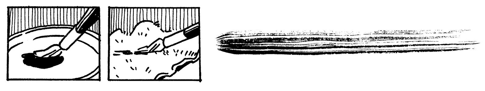
For a dryer look to your line, you’ll want to start with less water. The dish is useful here, because it will cause the ink to dry out and thicken, making it easier to create a dry brush effect, even on smoother papers.
Dip a dry (or mostly dry) brush in ink, try not to soak the brush too much.
Drag the brush across a towel or rag to pull out excess ink. You do not need to twirl your brush here, unless you want to shape it into a point.
Drag the brush on scratch paper to be sure the density of ink is where you want it.
Remember: test, test, test! This is why you have scratch paper.
Mark-Making Exercises
Now that you have your brush all ready to ink, why not experiment with the range of marks it can make? Smash your brush; drag it along in winding paths; practice pulling straight lines; creating clean arcs and circles. The best way to test is by doing, and this is a good way to warm up before beginning a piece.


You’ll find holding the brush at different angles to the paper will make certain marks easier. A lower angle (about 45 degrees) will make straight, even lines while holding the brush more upright will give you more control over varying line weights.
Make an effort to pull your lines in one stroke as often as possible. This creates a cleaner line and will help you develop your brush control. Turn the page as you go. Pulling lines towards you is more natural for your arm and wrist than pushing lines away, and will prevent the brush from skipping and making you line more ragged than you would like.
Rendering Exercises
Practice different rendering techniques by starting simply. Attempt various gradations using differnt mark making techniques, like hatching, scribbling, or tapping the brush. Attempt a “clean” dark to light render. Experiment with the different aesthetics created by different marks in both dry brush and “wet” brush. How do those variations effect the texture of the gradient? Are there textures you prefer more than others? Do you hate texture, and would prefer to render with more graphic shapes? Can you combine those techniques? Interrogating your likes and dislikes is a fist step to developing a personal style.

You can also test rendering texture on basic shapes. This is a good way to test a texture or rendering style without getting caught up in a lot of drafting. Spheres and egg shapes are good for this exercise, because they allow for smooth gradient transitions. Find places where you can eschew outlines and use implied edges and texture to define the form.

Stylization Exercises


Now that you’ve done all of these little exercises, it’s time to apply them to a drawing. Different applications of ink will create different stylizations. All artists have their own preferences where it comes to stylization, and the best way to decide what your preferences are is to test what ink applications suit you best.
Try using the same basic line drawing with different mark making applications and techniques, like dry brush, hatching, and implied edge.
Take you brush and ink outside from life. Do quick black and white studies to sharpen your sense of contrast and use of negative space to define form. You’ll find this exercise will help improve speed and your understanding of tonal qualities when translating color reference into ink.
Try mixing your mark making techniques in a single drawing. How are you able to define different textures using different kinds of marks? Do certain techniques muddy your drafting? Are there areas you are able to use less lines? Need more? How are you crafting your negative space? Defining surfaces and light? Showing volume and depth? How do your lines help to move the viewer’s eye along the page? Etcetera and so forth.

Whether you use a brush, nibs, or a q-tip, these are all aspects of inking: the utilization of marks and graphic shapes to create an image based in basic principals of visual design. That utilization looks different for different artists. The bast way to decide what suits your tastes best is to test, practice, and try again.

Brush inking, like any tool or media, requires patience and practice. The benefits of the brush, with its wide range of mark making applications and versatility in finishing techniques, have made it a personal favorite. It’s important to remember that the mastery of a technique comes with practice. Don’t wait “until you’re ready” to create a piece in ink. You will learn as much from your failures as your successes. The more you work with a medium, the more confident you will become.
As October– the month of inking challenges– approaches, I hope this post is helpful to some of you. Happy inking!
Links
*No link in this post is an affiliate link. They are there for convenience. Please, find your materials at the best price for your budget at the art or craft supply store of your choosing. If you would like to support my artistic efforts, consider becoming a Patreon or buying something from my store. TY 8)