
Welcome to the revival of my blog and hopefully the fist of many depthy discussions of my process and my recent projects. I find it hard, sometimes, to talk about my own work, but I think it’s important for an artist to interrogate their thought processes and review their own techniques to better understand what is and isn’t working for them. I don’t think the need to do this goes away in time. If anything, the more comfortable you are with your process, the more you should scrutinize your choices in that process.
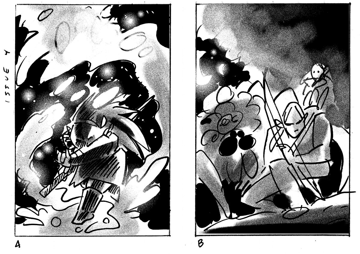
I had no time for this. That happens a lot when it comes to comic covers. They are often the last thing I am thinking about when I have interiors to tackle. I did have two ideas I really liked for the cover of 4. One was an image of the elves (Daniel and Leonard) with Mother Spider. The other was the Wise Woman and her magic in the Astral Plane. The former would have been a lovely, moody piece, but the latter – with only one figure and the worst of my worries being a great glob of glowing goo – seemed the piece I could turn around the fastest.
Shading for these was added digitally after they were scanned. Again. I had no time.
My editor agreed and I was off. I already sketch my thumbs to scale of the final image (they are often done on graph paper because of this)I use the computer to move things about post my thumbnail stage. This allows me to make sure I have enough bleed space and empty space. I then print out an enlarged version of my thumbs via my laser printer and use marker composite paper to do a final, clean line drawing.
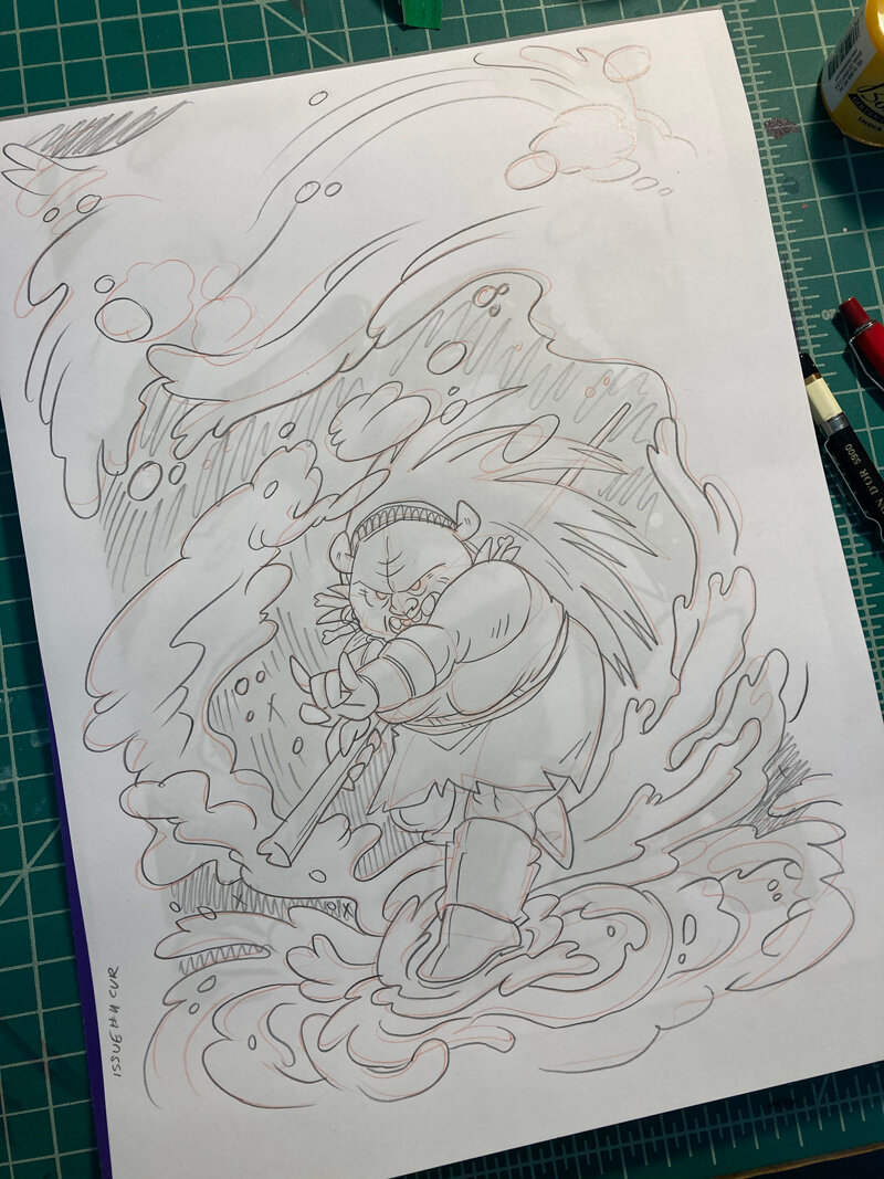
These pencils were done at 9 x 12” on Canson Pro Marker Layout Paper.

My work desk is very orderly.
Unless I am doing a drawing “off the cuff” (which is often what my sketchbook work amounts to), I use this exact process to create the final sketch for all of my work, whether that work is sequential or a singular illustration.
(One thing I did not photograph was my transfer step. I use a lightbox to transfer an enlarged version of my pencil drawing)
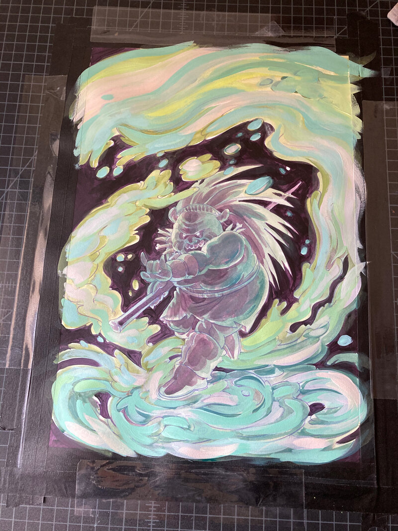
This image has a lot to do with light, so it made sense to me to focus on a basic underpainting so I could get a sense of that. There is still a lot of wasted time in my painting process, so it’s possible that I might have been able to forgo this step, but I did find it useful when it came to painting the Wise Woman later on. TI’m not sure the layer of washy green and blue I added helped beyond putting something down. Though, sometimes that is necessary in its own right to break the proverbial ice with a painting. I’m not sure it matters either way at this point, but in an attempt to make my painting process more efficient, I may forgo washy colors later. Unless I don’t. I’ve had many conversations with pals that paint regarding the little things we do to make a piece more approachable. Sometimes, that counts as part of the process, even if you don’t see it in the final outcome.
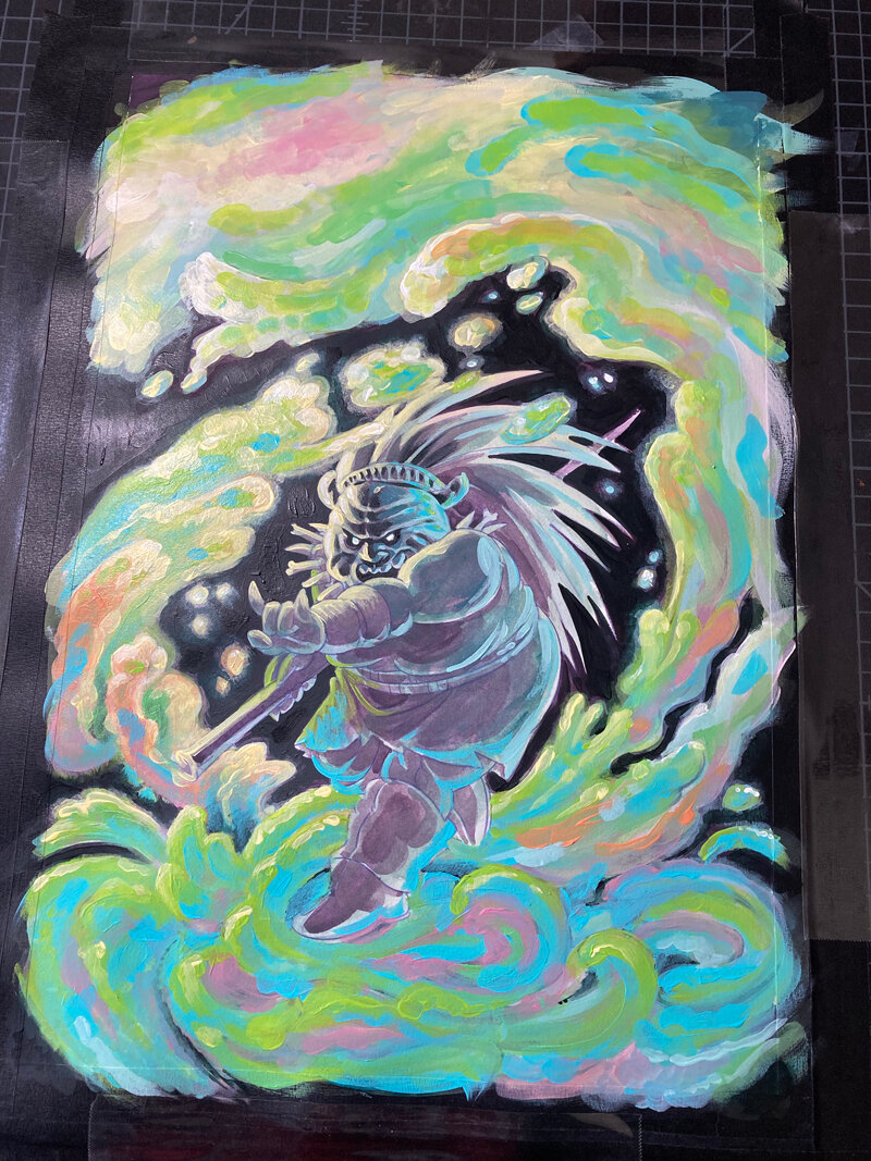
Getting the colors right for the shapeless mass took me a long time an a lot of mixing. Once I found those colors, I mixed enough to finish the painting and saved them in little containers. Painting this took three days, and I would have wasted a lot of time and paint if I hadn’t taken this small, quick step to save my mixes beyond a work session. Because I am working in acrylic and liquid acrylic, my paint is drying very fast (even with added retardants) and I can only work wet in wet for about five minutes per section. Because I am also taking a small break every 45-60 minutes, saving my paint beyond a session seemed imperative. I am using small condiment containers for this purpose, which were an inexpensive buy off of ebay.

I am lining my palette with wax paper for easy clean up.
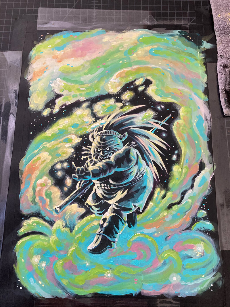
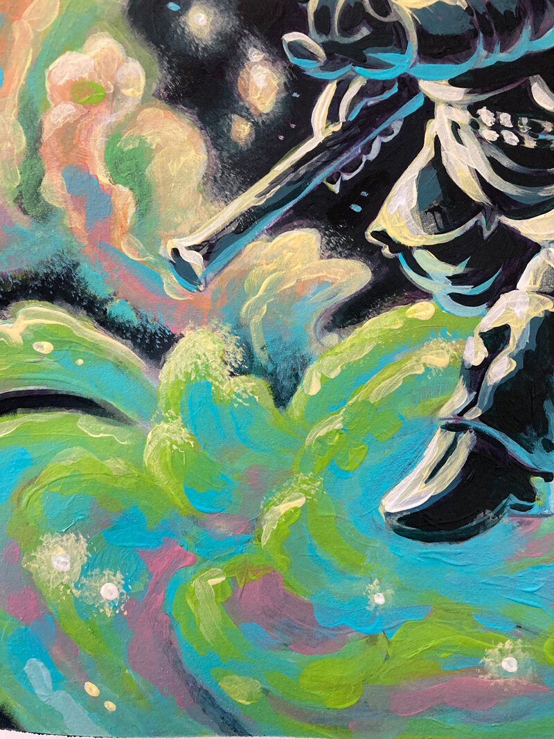
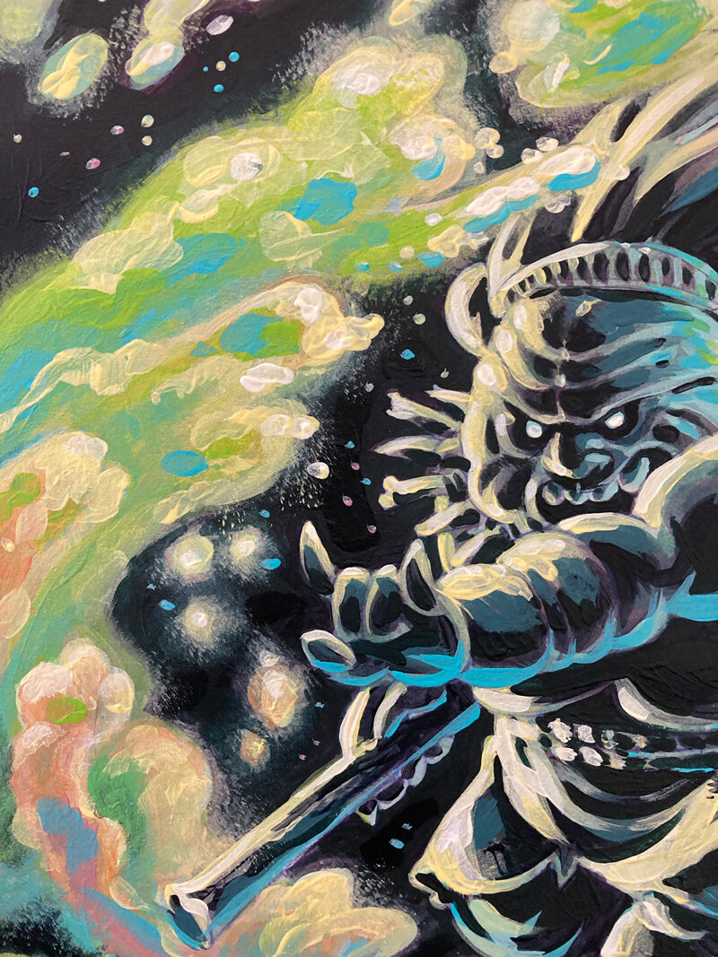
What follows is the progression of paint build up over the course of my painting. I doubled back to paint over sections a few times while I tried to get the right warm/cool balance to that it felt as though the colors had volume. A big part of this painting’s visual effect is the fact that I am mixing colors of the same intensity and tone, but varying the hue, which causes them to vibrate and adds to the psychedelic effect. Contrasting that against a dark figure is why the Wise Woman immediately stands out.
There is a lot of color theory in this painting.
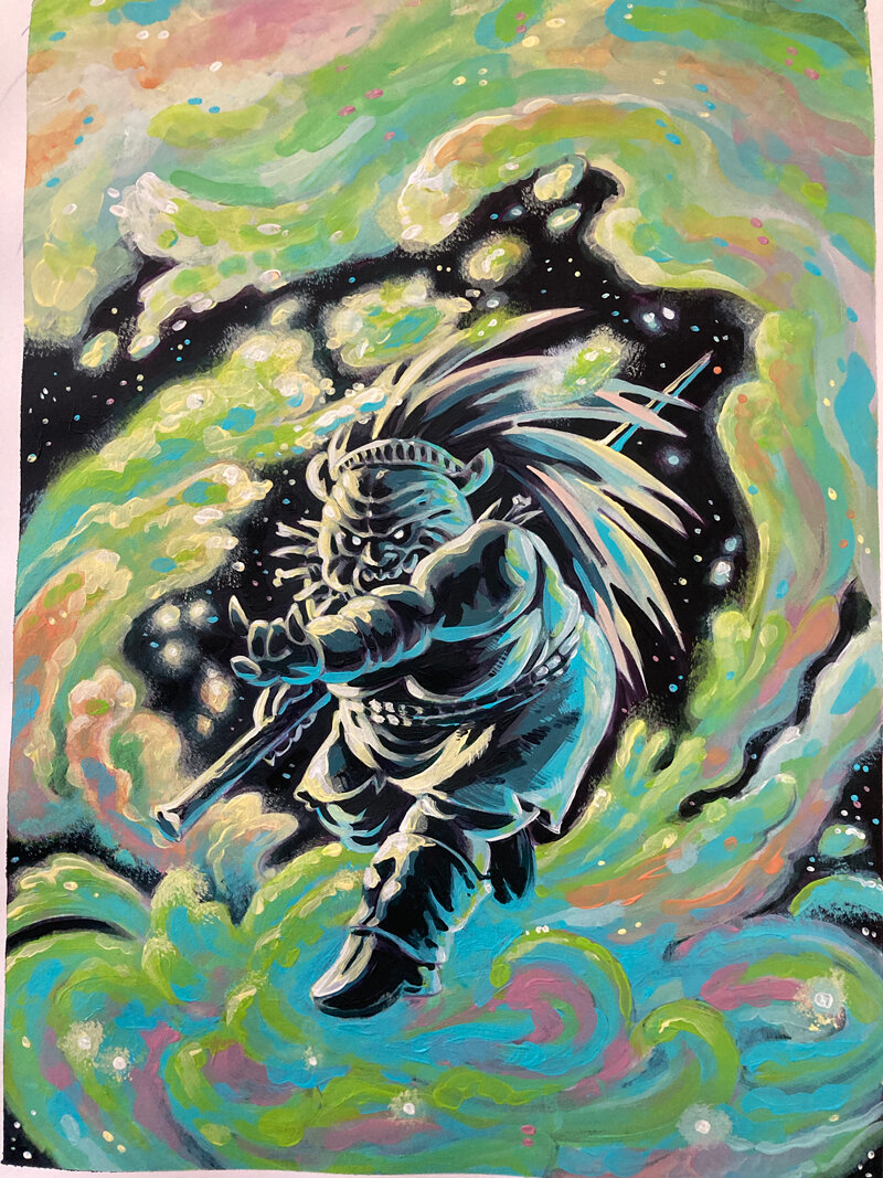
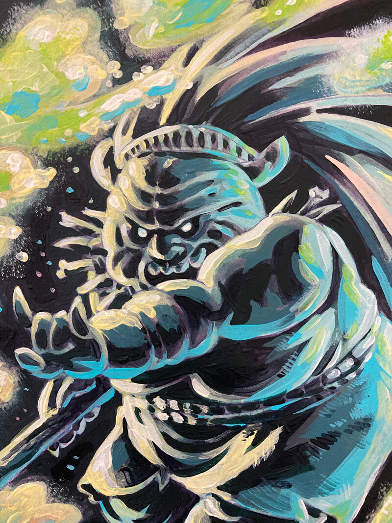
Here is the final image with close up photos of the details. I was working towards using up some older acrylic pain that I mixed heavily with fluid medium, so there are some globby brushstrokes– especially in the colorful masses – that I wouldn’t have with the liquid acrylic.
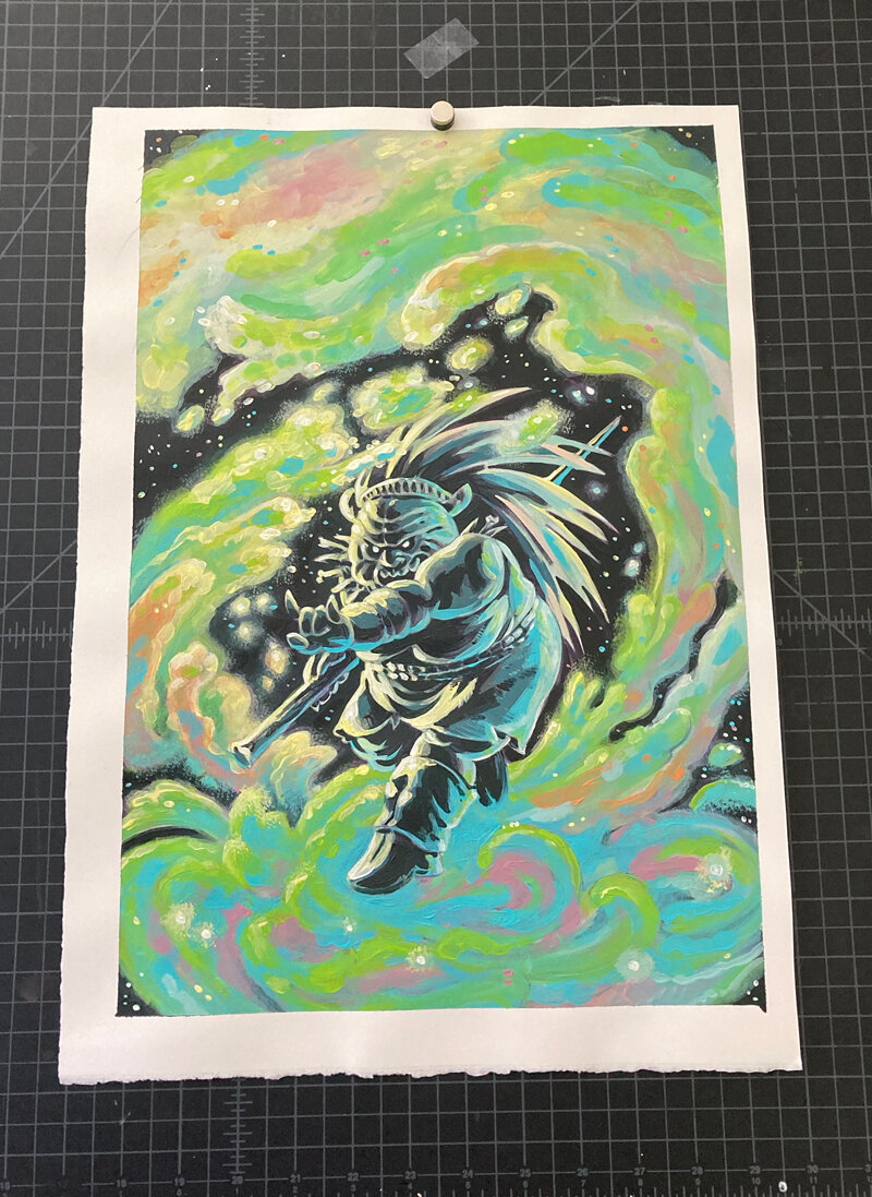
This is now the fourth painting I’ve done for ORCS! covers. Can’t wait for these to get out into the comic store wilds.
