After finishing ORCS! The Curse, I promised myself I would take some classes. I’ve been feeling the itch to change things up, and the desire to move my work into n even more analog space than it already occupies. So, I decided to take a Continuing Education Editorial Illustration Class at PAFA, which is taught by James Heimer.
I’ve done editorial work sparsely throughout the years. However, sequential work has largely dominated my portfolio, especially in the past decade. This has been somewhat frustrating, because I do enjoy doing work that is conceptual. I’ve simply never been very good at building out a whole portfolio in my spare time.
I went to undergrad school with James (James, you need to secure your website, bud), and have watched his editorial work develop into some of the best in the field. I felt like it would be a good move to be a student again, and learn from someone who actually has a solid handle on the editorial side of the business. It was a huge bonus that this is a remote learning experience. Getting time to leave the house for a few hours every week is nigh impossible with a spouse that also works and a 7 year old.

A class exercise from week 1
I was really nervous about being on the student side of the desk again! On one hand, I am returning to this role with a skill set I never had as an undergrad. I’m not struggling with media like I used to, or laboring over draft after draft to get the aesthetic I want. But I did learn that I still have all the nagging self doubt over my work that I had 20 years ago. Does this fulfill the assignment? Am I overly focused on what is expected and producing work that doesn’t fit my portfolio as a whole? Aw, crud, how do I want to finish this? Does this look “editorial”?

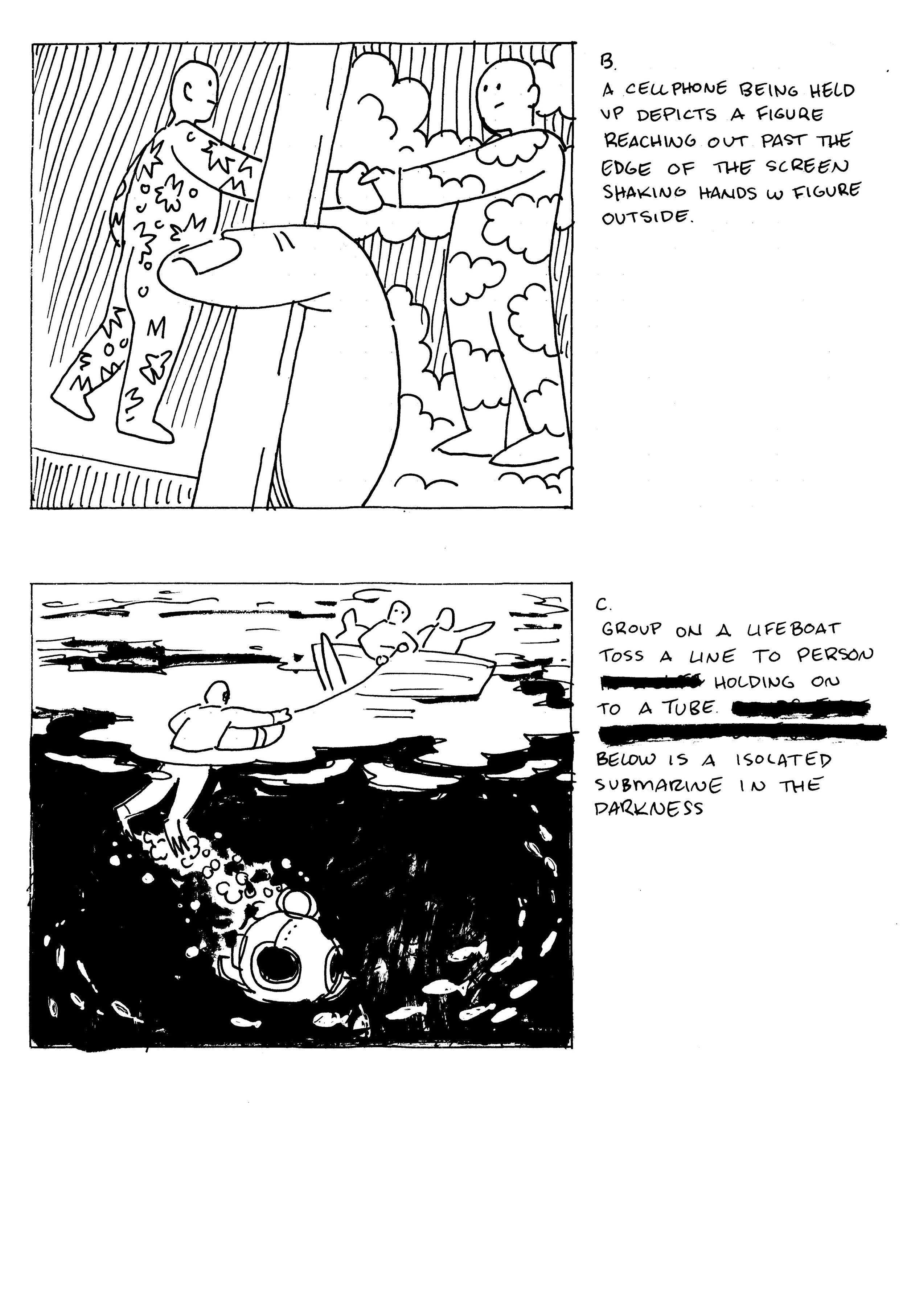
Assignment 1 ideation and thumbnails
I was relieved that the preliminary work for illustrating was something I have done so many times that it was not the chore I considered it back in school, though my thumbnails are still scribbling nothings. Thankfully, James wasn’t the stickler for perfect thumbs that our old professors were.


Ultimately, after a lot of class discussion and chatting with James for a bit, I went with the astronaut image. The idea was far enough away from the article (which centered on human interaction among strangers) that it felt like a compliment and not a direct reference. It also felt very “in my visual wheelhouse”.
This is where taking a class moves away from actual freelance. I am doing this to build out a part of my portfolio that has been sorely neglected, so these assignments are more for me than someone else. There isn't a "brand aesthetic" I have to aim for. Or an image in an art director's head I have to try and recreate. This piece is still, very much, me.
9 x 12 brush and ink
I'm not sure how well I did at "creating an editorial image," though. It's a nice painting. I really like how the asteroid came out. I'm pleased with my dry brush technique in the black and white image. But I think it's a hard sell to an editorial art director. Not just style-wise, but also because it looks like it took longer than it did (I finished the acrylic painting in 5 hours). Both seem to fall more in line with sci fi magazine illustrations then they do editorial pieces.
9 x 12” Acrylic
I did like that I learned a lot about speeding up my painting process for this assignment. I also feel like I’d like to bring more of my line into my painted work for future assignments. But we’ll see how things go. At the very least, I have a new way to examine my illustration work moving forward.
I have a feeling I am pushing my work in some direction, lately. I’m not sure what direction that is ultimately going to be, but I’ve decided to enjoy the journey for now.